Digitizing Gratitude
In 2018 Wishlist Rewards switched from a B2C gift card shop to a B2B experiential rewards program. The UI was 4-years-old and the UX role had been unfilled for 6 months.
I was hired to redesign the platform and expand the struggling product to help companies meaningfully recognize their employees.
The impact was a 2019-2021 SaaS growth of 133% and a 2020-2021 YoY revenue increase of 124%.
Part 2, The Marketplace
TLDR: Redesigning the Wishlist Marketplace (a place where employees go to redeem rewards sent by their company) accomplished both business and user goals. The new designs led to a higher reward redemption rate, fewer support tickets, an increase of products redeemed that were previously hard to find, an increase of products with higher margins redeemed, automation optimization leading to 16% of reward bookings being automated, and a previously non-existent revenue stream of in-platform upgrades, which to this day accounts for 15% profit of all experiences sold on the platform.
Talking to our other users.
At the time of my initial research at Wishlist, we had two primary users– HR program admins and employee reward recipients. We had been focused on the admins (who we were selling to) and hadn’t been engaging with the reward recipients.
Based on my interviews with our HR admin users, I knew that we needed to keep reward recipients happy in order to reduce churn and keep engagement high. I set out to meet this user base.
The findings were revealing for everyone on the Wishlist team.

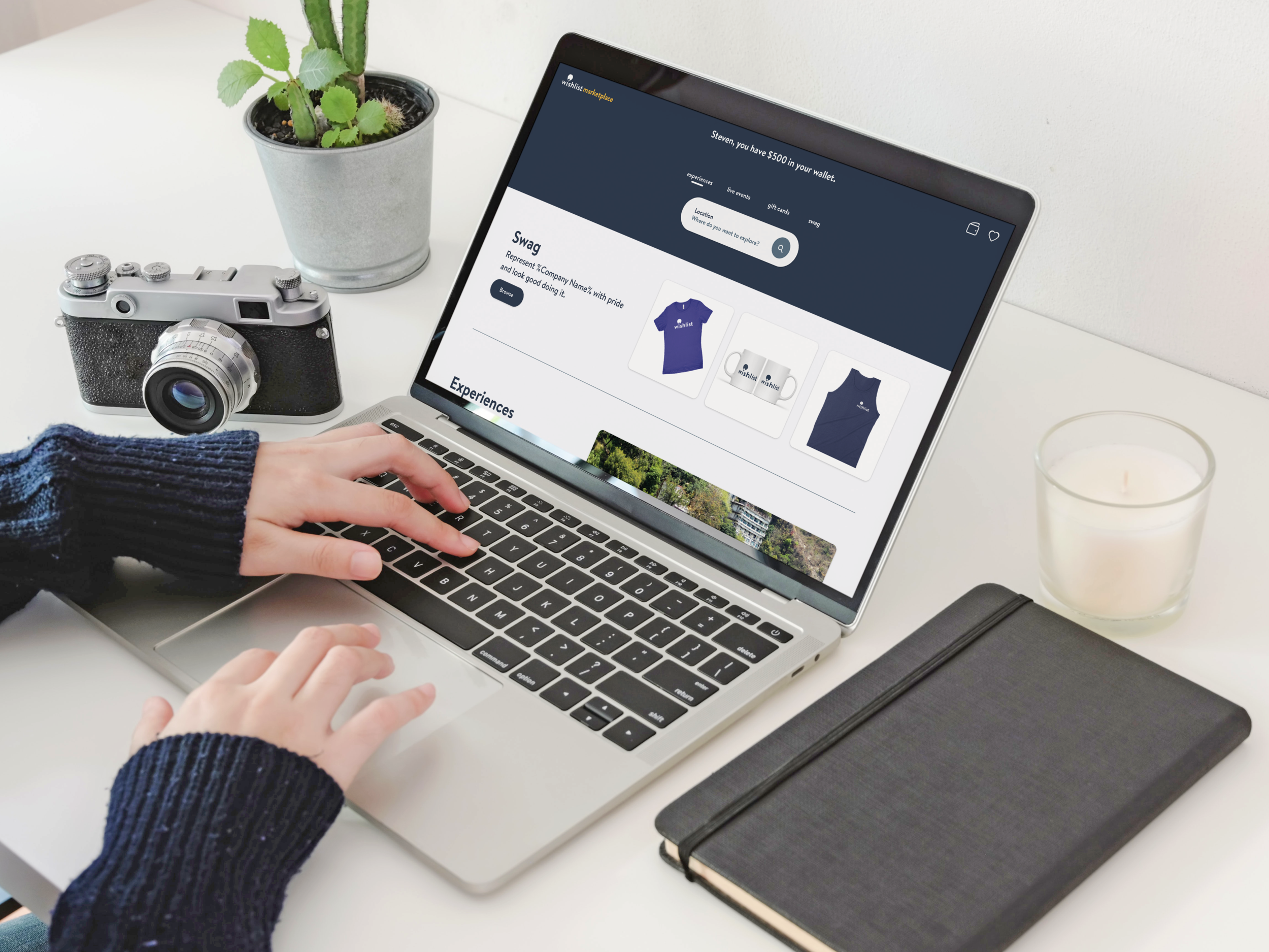
Original Wishlist Marketplace

Current Wishlist Marketplace
5 User Interviews.
5 Key Insights.
Learnings from reward recipients.
Users weren’t aware of the variety of product types because product categories were hidden within nearly invisible tabs.
Users couldn’t find the experiences they were looking for and got frustrated when they attempted searches only to receive poor results.
Users wanted to but weren’t sure how to spend some of their own money to level up their rewards.
Users didn’t know if they were getting a good deal on a reward selection because their reward’s monetary value was hidden from them.
Confirmation emails on bookings, containing key information for reward receipts, would get lost in users’ inboxes. This resulted in a poor user experience and hours of Wishlist’s support team’s time.

What People Said
“Less work. It’s a reward… I don’t want the process to be laborious.”
“I tend to go for gift cards because they’re easier for me to use in my life; when I look at the experiences on your website, it looks like they’re a lot of work to book.”
“I did use one experience– to go to Lego Land with my family, but I had to call your support to upgrade to the package I wanted. And I didn’t know you could do that.”
“I had to go to the vendor’s site to look up the price because I wanted to make sure I was getting a good value for my reward.”

The Recipient Story
Problem
The Wishlist Marketplace was undiscoverable and difficult to navigate. Our product offerings and search frustrated users. The user flow to redeem a reward was overly complex and deterred usage. There were untapped revenue opportunities for users who wanted rewards that were out of their reward tier range.
Solution
A redesigned marketplace with a modern, e-comm feel and familiar navigation patterns. Search and filters that aligned with user expectations. An upgrade option for users who wanted to level up their reward and were willing to pay a little extra. A seamless booking flow that eliminated redundant steps and gave the user a delightful feeling of success.
My Role
The sole designer, in charge of UX research, product strategy, wireframes, prototypes, usability testing, UI mockups, and documentation for handoff to Wishlist’s offshore development team.
A Challenge

Each Wishlist reward is based on a unique gift card code and a specific, individual landing-page URL, constraining the solution design process.
Process

Early sketches and concepts

High level site map

Early Wires

Early concept before our rebrand

InVision prototype for testing and documentation for handoff

Mobile designs
Solutions
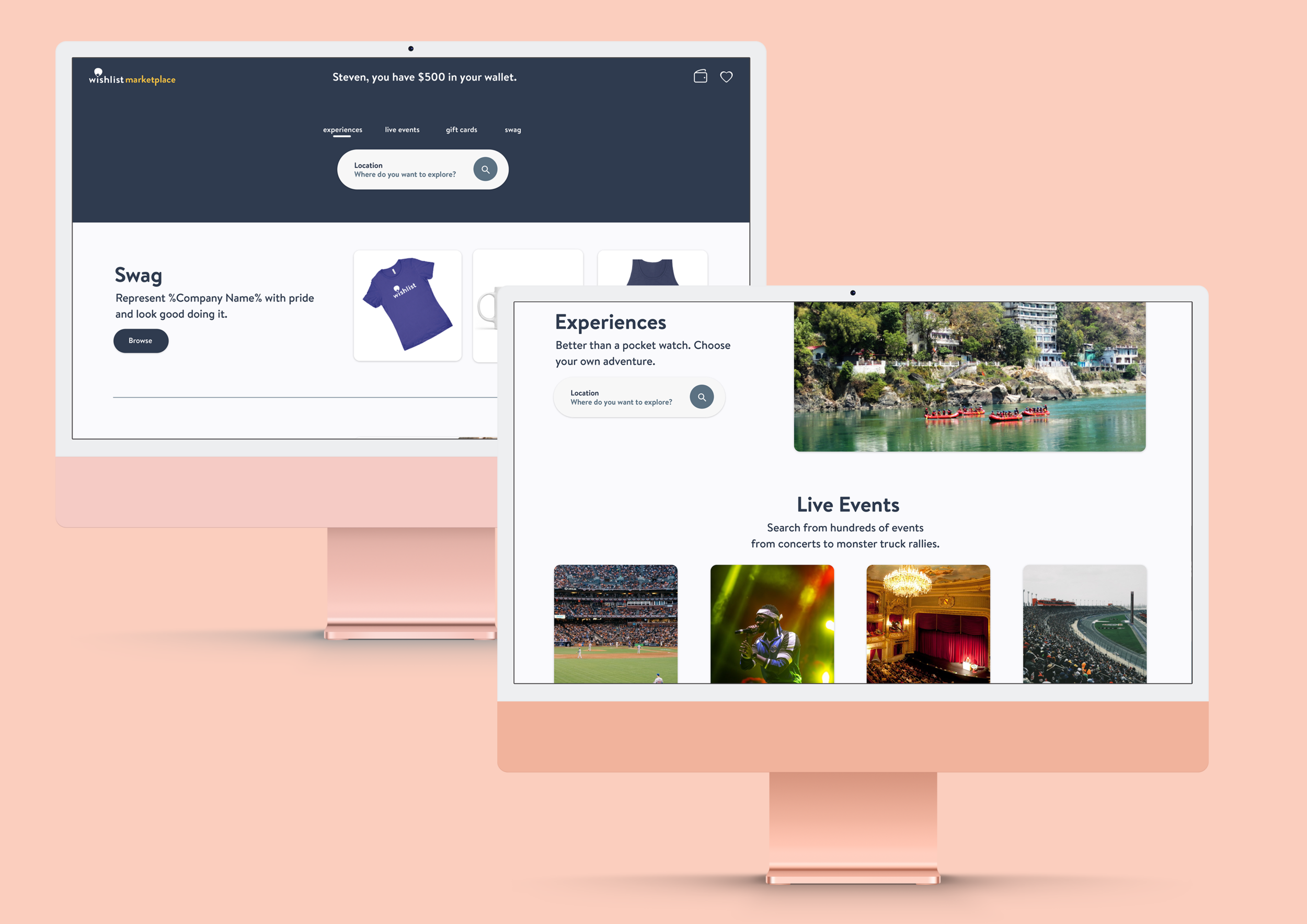
The redesigned landing page allowed users to preview options of all product types available to them. This brought awareness to product types like hotels and travel, which previously had an extremely low redemption rate.

I replaced an open search bar with a constrained set of filters. Users previously didn't know what to search for and would become frustrating with the process.
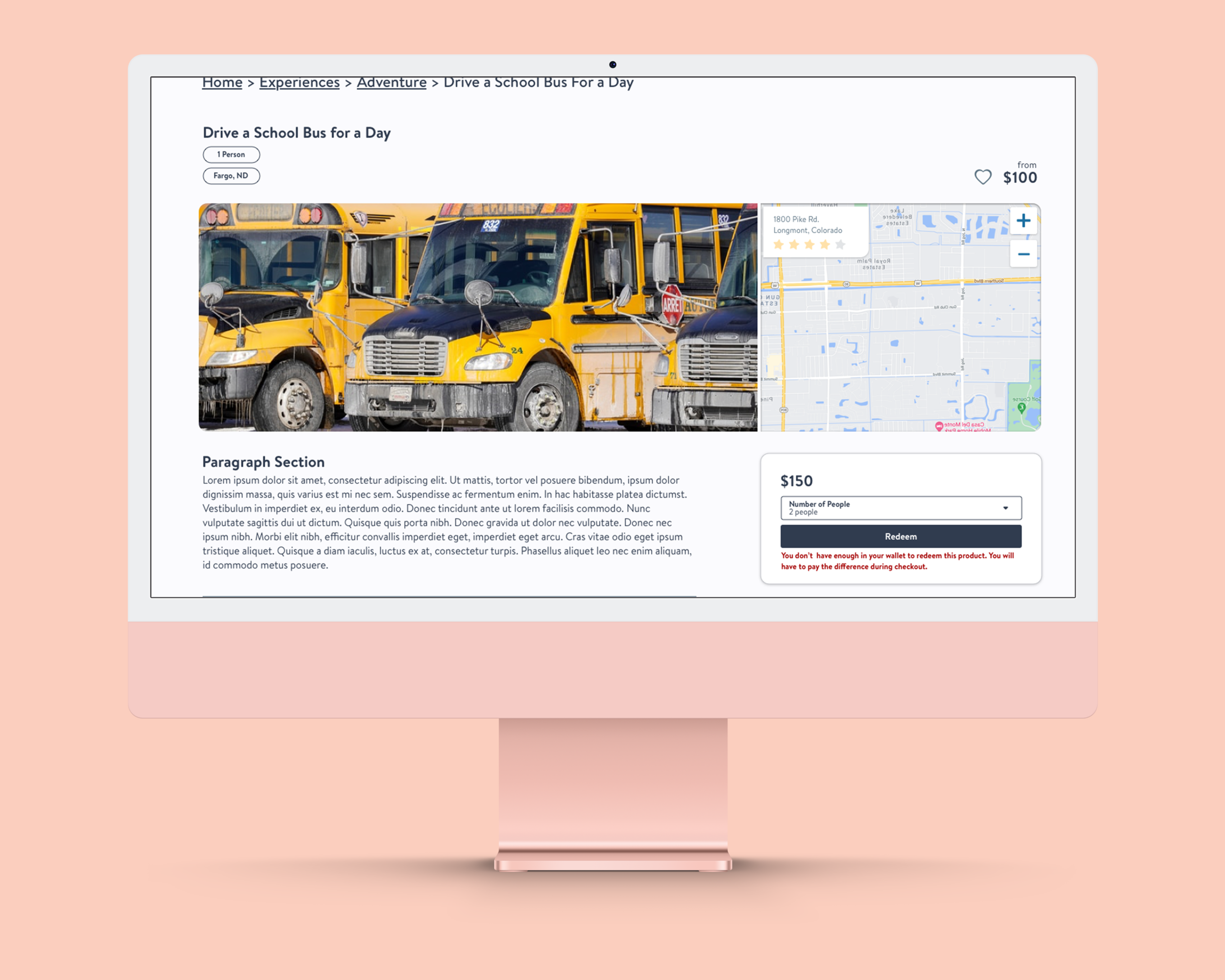
Before the redesign, users had no way to know that it was possible to upgrade their experience to a higher price point. The workaround was to call into support and pay extra manually. I design an in-platform upgrade feature to supply the user with more reward options and give them the ability to spend more money for a better overall experience. This lead to a new automated revenue stream.

By implementing a wallet feature in Marketplace 3.0 and displaying the monetary value of rewards solved several problems. Firstly, the user now had context as to the value of their reward without having to go off platform and search for the experience on the vendor's website. Secondly, it allowed us to move away from a unique URL landing page, tailored to specific user's rewards, freeing me to design a more familiar e-comm shopping experience. And lastly, it allowed users to combine their reward dollars instead of calling into support to do so.
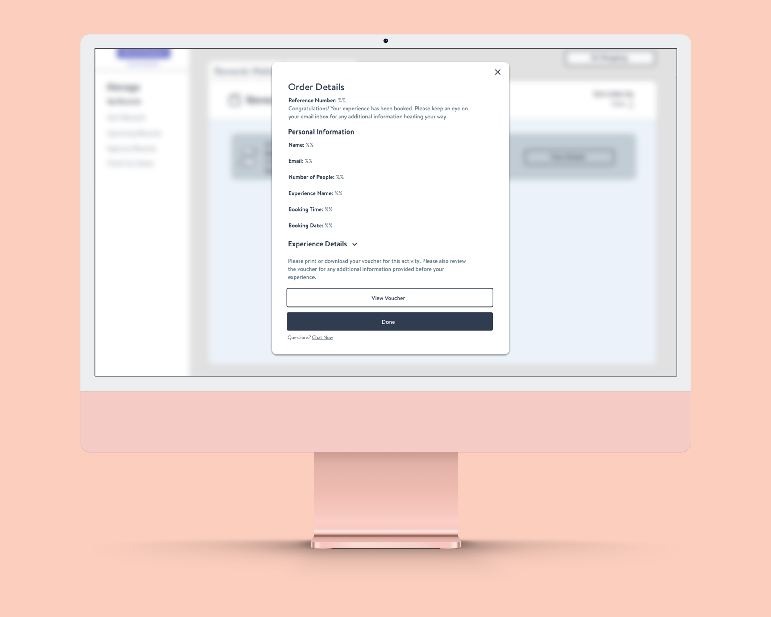
I designed a place on-platform for users to access their reward redemption confirmations. This allowed them to keep track of key information needed for the experience. Otherwise, the user would have to track down their program admins or contact Wishlist support.

Including a favorites features in Marketplace 3.0 was only possible because of some of the other infrastructure changes we were able to make. This feature delighted users and provided some relief for those who had been requesting it for years.

When speaking to users about products they were really looking for on the marketplace, a few items stuck out. I designed highlight cards for the marketplace landing page, pulling out specific products like restaurant gifts cards, which were in high demand. This design also allowed Wishlist to highlight higher-margin items, contributing to the company's bottom line.
Impact
The marketplace redesign resulted in higher redemption rates and an easier search and booking experience, proven by our customer feedback and a drop in support tickets. It also proved to expand the range of product types our users were redeeming.
Wishlist also gained a new revenue stream with on-platform upgrades, which, to date accounts for 15% of marketplace experience revenue.
I rebranded Wishlist and redesigned our admin portal and rewards marketplace in 2018. Revenue double in the following two years and is projected to double again in 2021.
In one case study, after implementing our new software one of our clients saw 37% of employees rewarded, a 92% engagement rate, and an ENPS up from 27% to 52% since the launch of their Wishlist Program.

Recognition.
Coming Soon… The ultimate stage in our product’s evolution, our recognition platform completed Wishlist’s journey from a B2C gift card shop to a Rewards & Recognition HR solution and viable SaaS business model. It was also the final piece of the puzzle to solving the problem to Digitizing Gratitude.