Photofeeler

Getting to work.
The Challenge
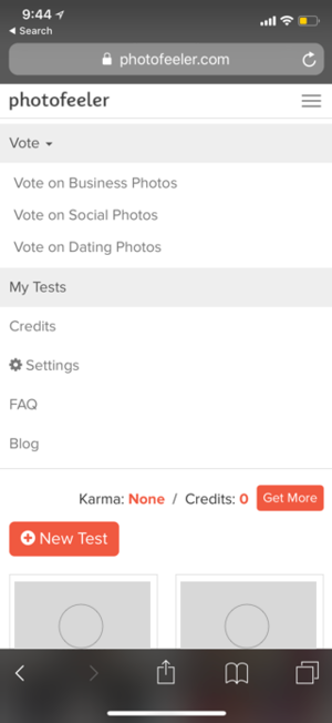
Photofeeler wanted to redesign their voting page to increase the size of users' photos and incorporate more current features. They were concerned about crowding the screen.
My Role
Ideation, Wireframing, and UI design.
Learning
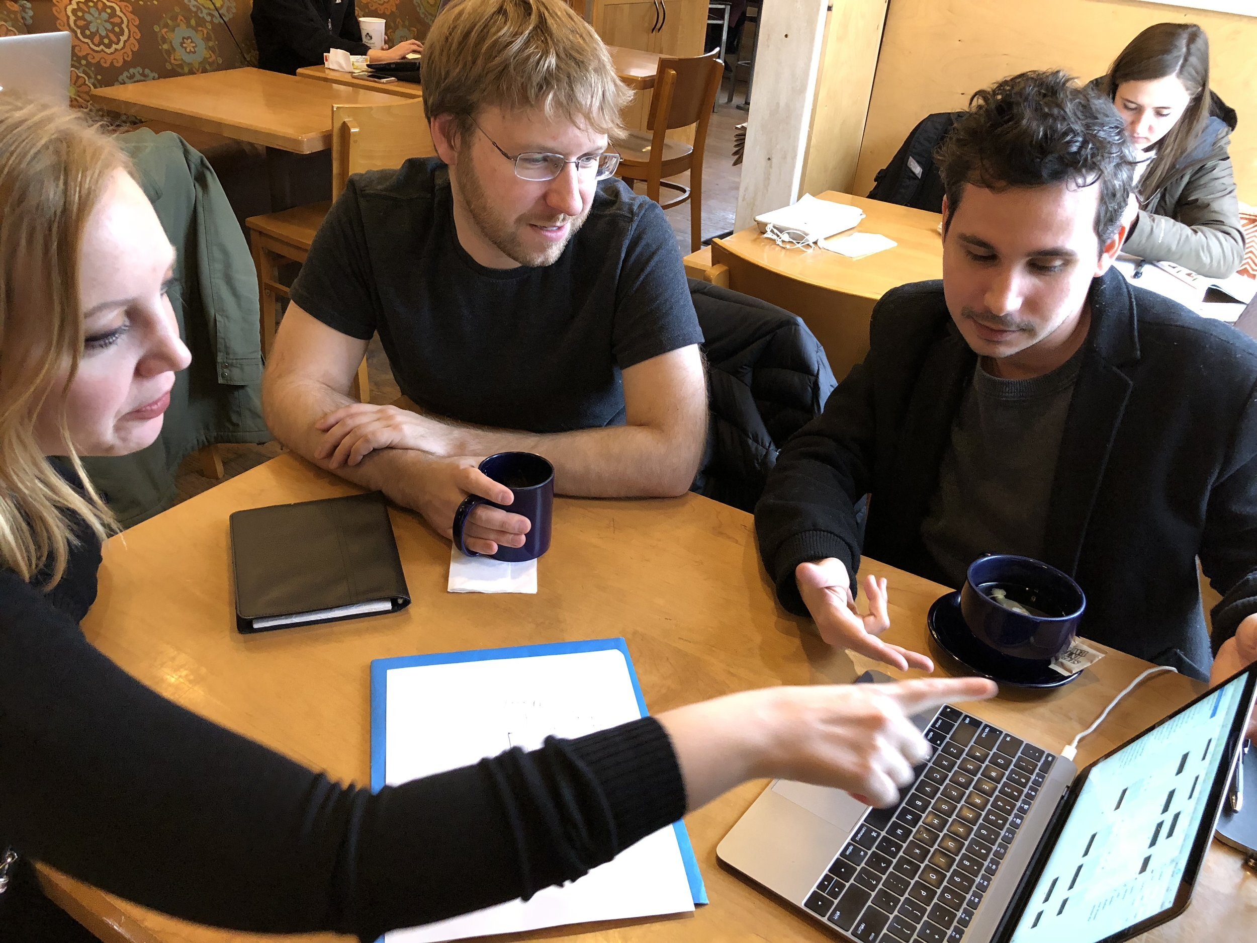
Our team of two jumped into this project with 25 screeners and 12 interviews to learn what people wanted to know about the images they use on social media.
Our Findings.
-
Trust.
Women trust friends over strangers to grade their photos because their friends already have context.
-
Not early adaptors.
Users did not want a video or a live photo feature unless it was already mainstream.
-
Gallery.
Users wanted to be able to rate entire galleries of photos of a single person for more context.
-
Visual Context.
Users wanted a way to rate photos with some kind of visual context as to where the photos would appear.
Meet Mary, Photofeeler's main target user. She needs to feel comfortable on the app and find value in Photofeeler if she's going to use it.

Iterations & Testing
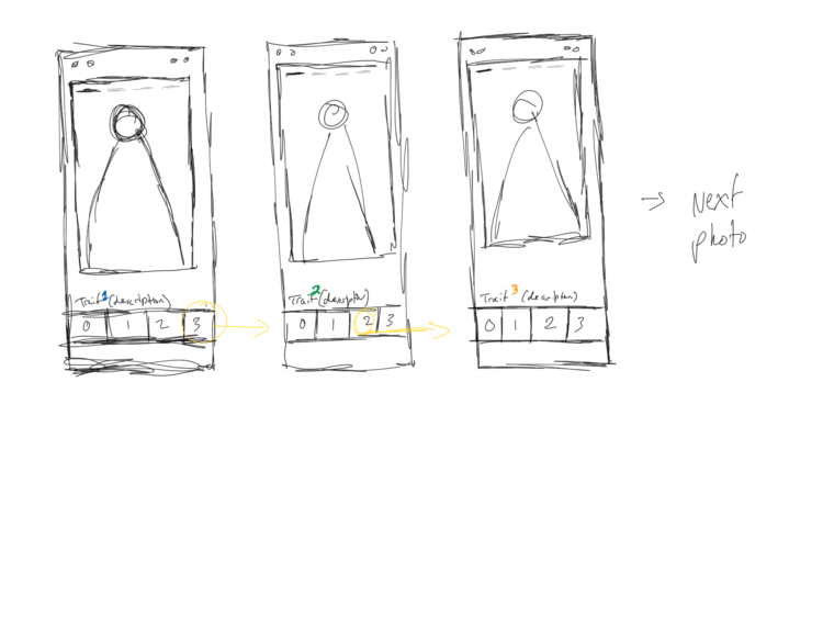
Sketches
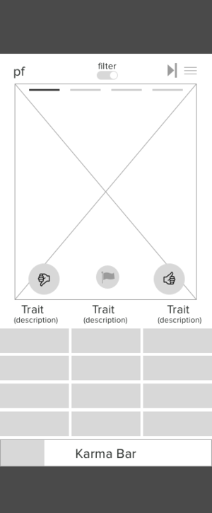
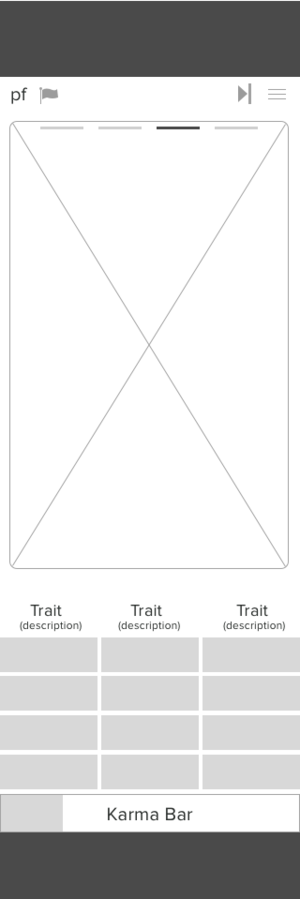
I started playing around with different gallery designs, applying visual context in the form of photo frames. I also began to play with creating more room by thinking about how we can minimize the space taken up by the voting buttons.


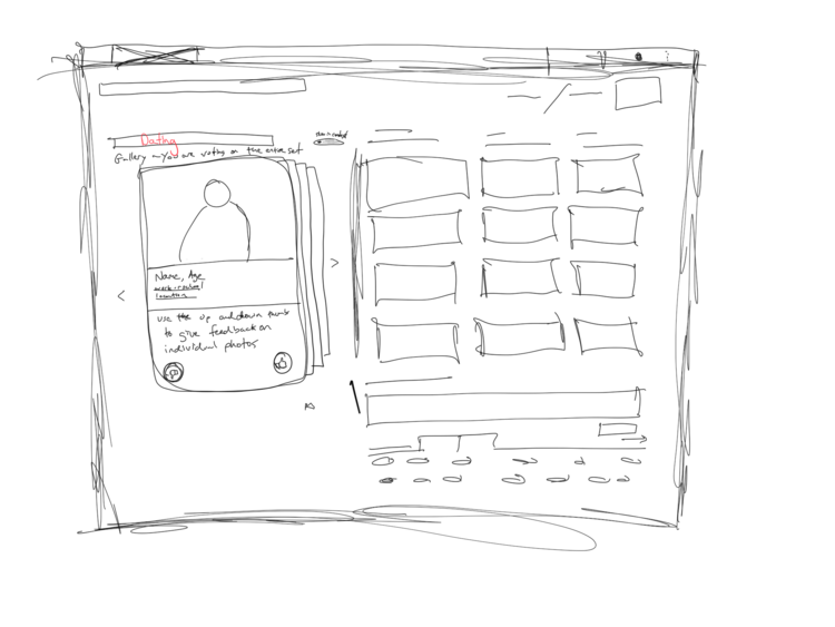
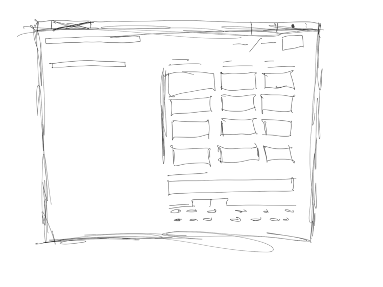
Mobile Wires
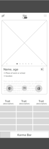
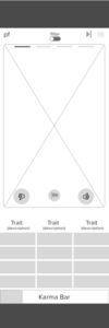
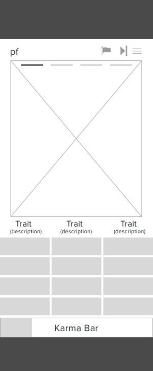
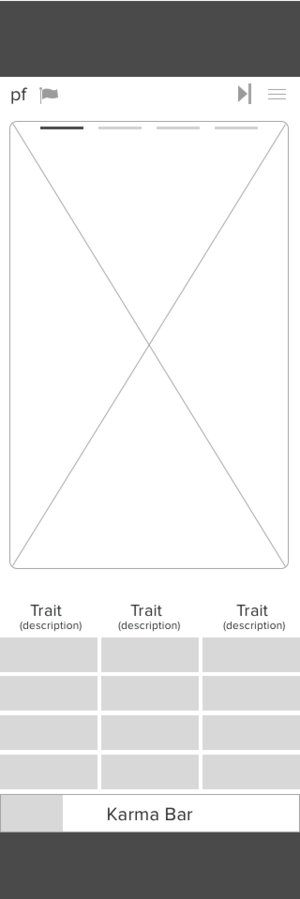
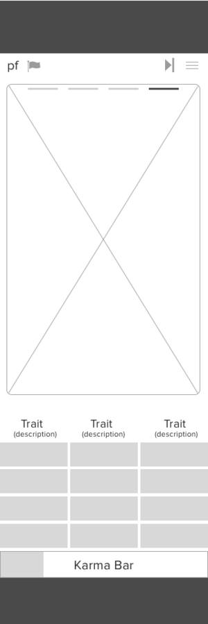
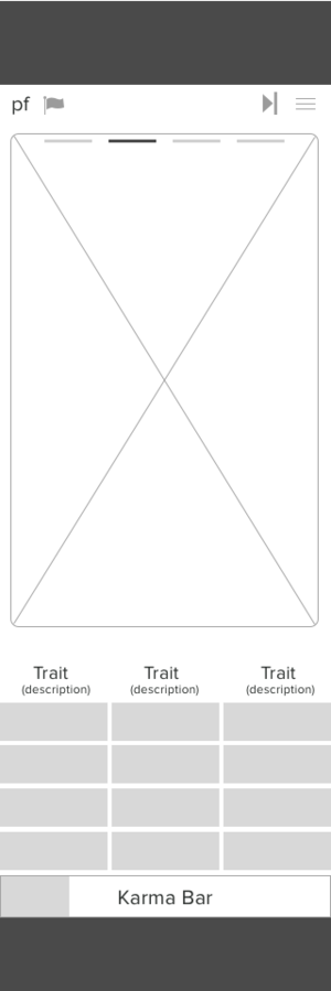
I wireframed several concepts for a voting screen with galleries and visual context. A problem presented itself in terms of screen size. The current Photofeeler voting process required no scrolling. We needed to test scrolling...


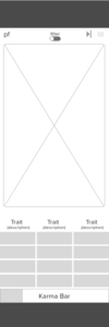
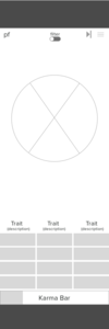
Scroll Test
I built a mobile flow for voting, and we discovered that scrolling wouldn't work if we wanted the user to keep the photo in the screen for context and also make the photo larger.

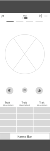
Design Studio
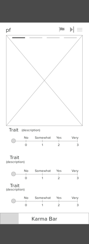
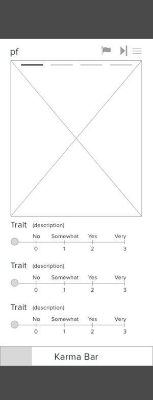
Scrolling failed user testing. I lead a design studio to come up with alternative layouts for voting buttons in order to maximize space for a larger photo.


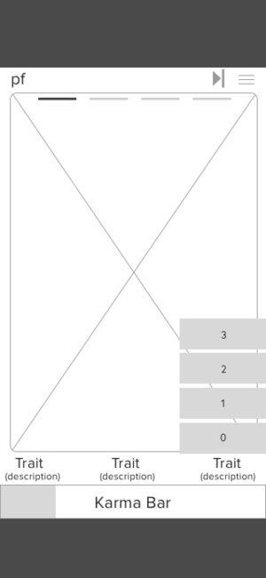
Wireframes & Testing
After picking a winning design, I wireframed and tested it before designing mockups.


Solutions.
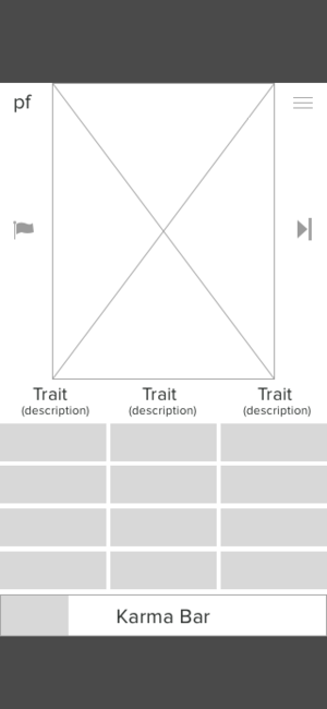
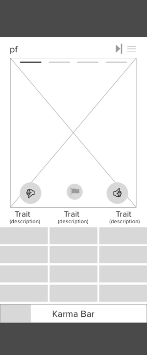
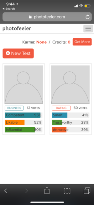
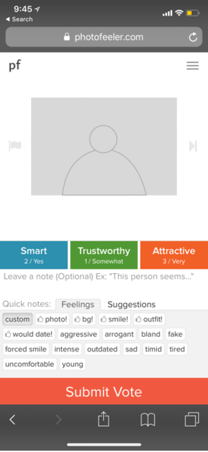
Validated through testing, I was able to redesign the voting page for Photofeeler, incorporating a gallery feature and visual context. The dating voting screen is based on a Tinder card, the business voting screen is based on LinkedIn, and the social voting screen is based on Facebook.
Mary needed a better way to experience the visual context of the photos on which she would vote, and those she would test.
Now she can participate in Photofeeler with a sense of value and understanding that didn't exist before.
Photofeeler likes this because it achieves their business goals of updated features, larger photo size, while decluttering the screen.
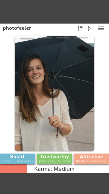

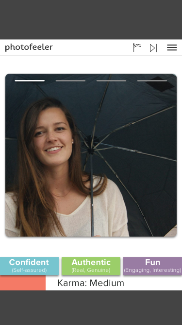
Increased Photo Size

Learnings
Incorporate a "notes" page at the end of each photo in a gallery for voters to provide more context
Galleries on the voting pages need a larger callout to let voters know that they're voting through multiple photos
Future iterations:
updated buttons to give their look a more current feel
desktop mockups