Health Calculator

Getting to work.
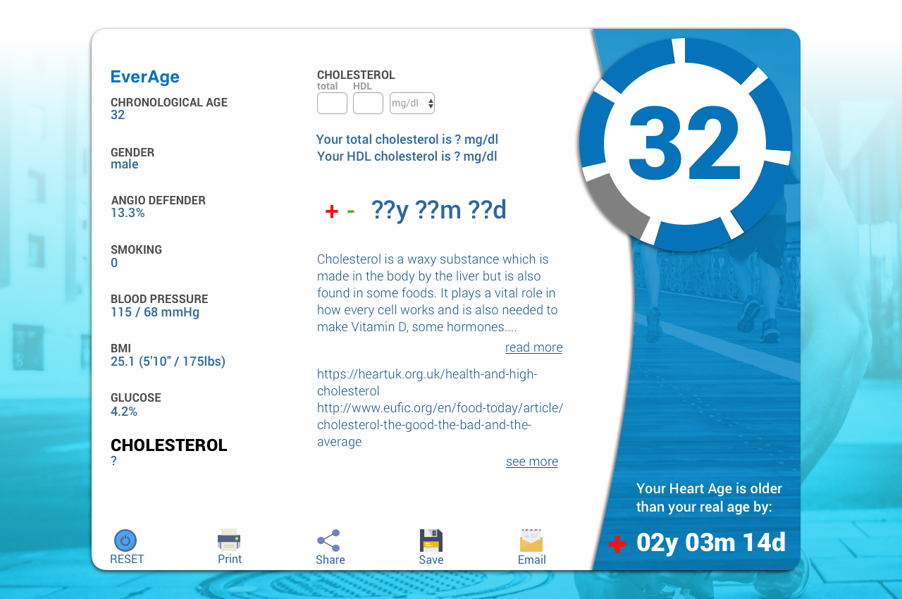
The Challenge
Everist Health needed a redesign of their health calculator because the UI was overwhelming to users and the design was outdated. They wanted an idea of how their calculator might look on mobile and how they could better merge their existing desktop dashboard design with their calculator.
My Role
Ideation, Sketching, and UI design.

Issues with the original design:
Users were overwhelmed by the amount of data presented on a single screen
Some of the jargon didn't translate
Users didn't need some of the data presented
The UI was outdated and some of the icons didn't translate

Solutions
-
Jargon Clarity
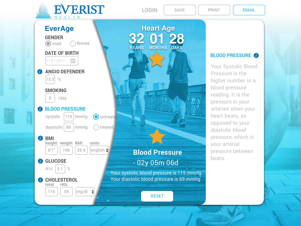
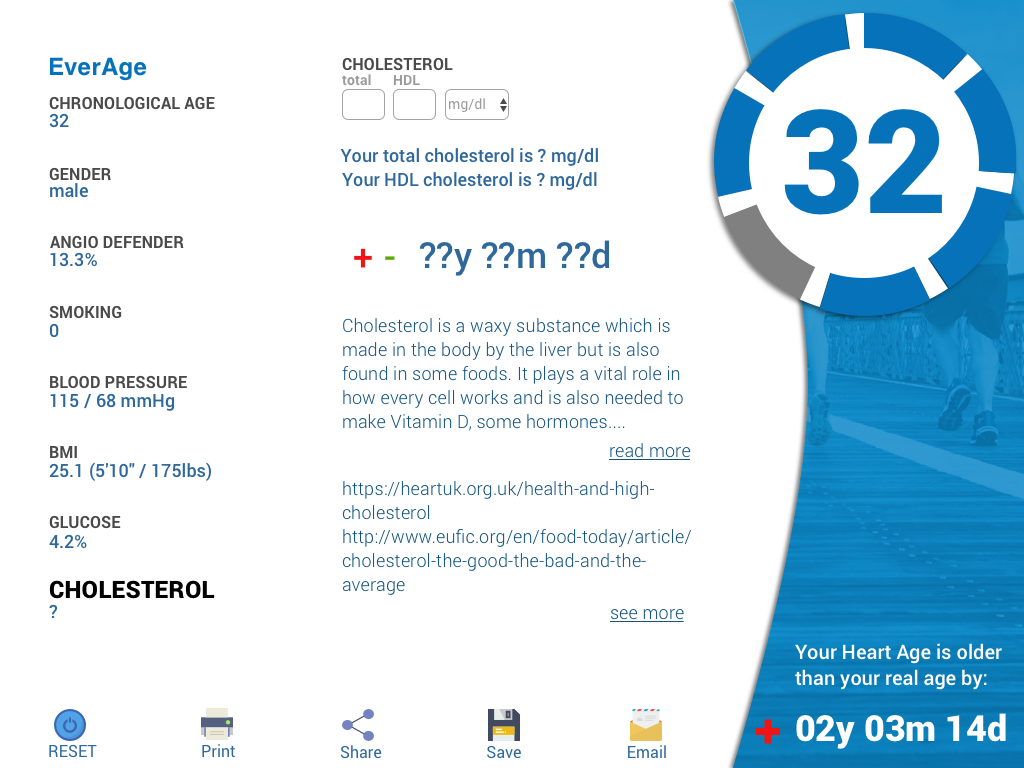
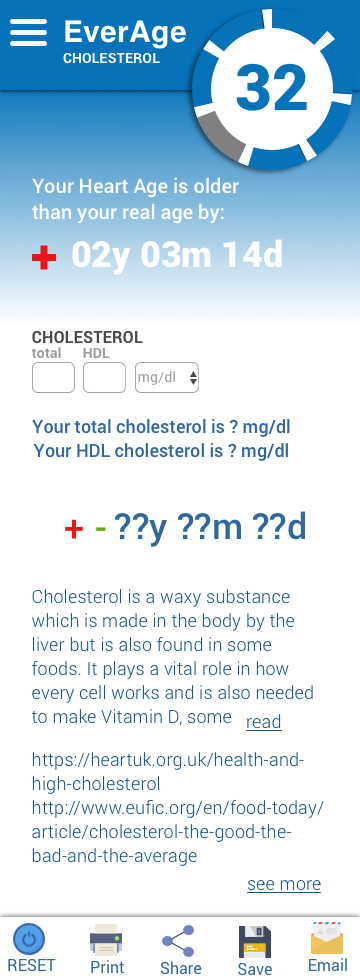
Rename "Vascular Age" to "Heart Age", and make it the focal point.
-
Cognitive Underload
Show data from each category one at a time, so as not overwhelming the user.
-
Simplify UI
Remove confusing icons and update the UI to more recognizable patterns.
-
Visualize
Include a progress indicator.

Everist Health wanted a quick visual mockup before going into wireframes and visualizing final mockups.
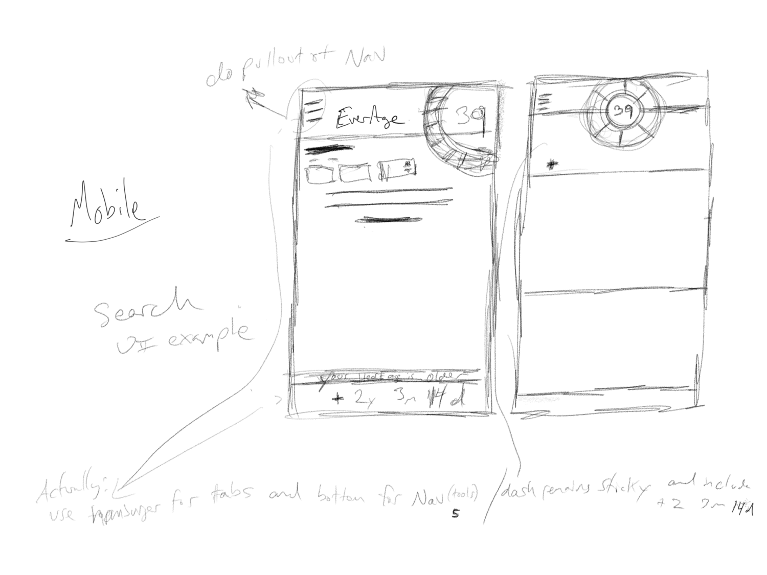
Wireframes
I wired out each category of the Calculator and then adjusted the design to fit their dashboard.


Final Mockups
After approval, I mocked up the tablet for the calculator and gave Everist Health an idea of how their design could flow on a mobile screen.

Learnings
Without user-testing, it was difficult to ascertain what data was most valuable to the user.
Having icons for the sake of icons is not helpful and takes up valuable interface real-estate.
It is vital to understand the user and their needs before jumping into a design.